A video published on the Oculus Developer blog has revealed a redesigned toolbar for the Quest home menu.
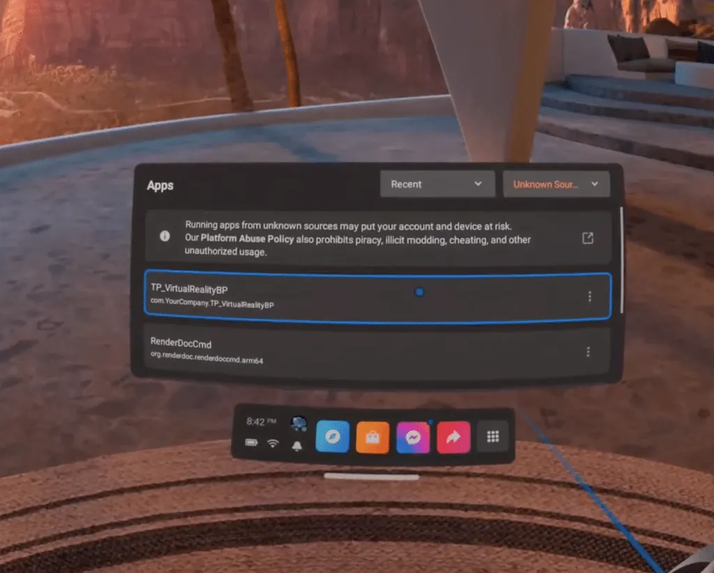
The video in question, embedded above, relates to the new instant runtime-drive splash screen functionality but also happens to show a redesigned toolbar that has more colorful, square-shaped icons than the current design.
It’s anyone’s guess how far out this new design is for Quest users, or whether it will actually make it into a software update at all. There’s a chance that the new design is just being tested and could be changed significantly (or scrapped entirely) before it’s launched publicly.

That being said, the squared colorful icon design is visually similar to app icons found on a phone home screen – the Messenger icon looks especially similar to its mobile icon counterpart.
We’ve seen some indications that the Quest might get support for running mobile Android apps natively on the headset, and this new redesign would fit right in with those plans. An Instagram or Spotify app icon would look right at home among those new colorful icons in the toolbar redesign.
With the app library icon moved to the far right, it might even perform more like a ‘recently used’ toolbar, where each icon is replaced with Quest and Android apps according to how recently they were last used.
Overall, it looks like a pleasant and welcome design change for the Quest toolbar – a bit of color never hurt anybody!
Do you like the look of this new Quest toolbar? Let us know what you think in the comments below.